Power Graphs (again)
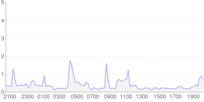
26 Dec 2010For the last couple years, I’ve been logging my energy usage and producing daily graphs of the data. Back then, I wrote about how the Google Charts API could be used to generate nice looking graphs; the result looking like this:

But in practise this isn’t what I have been using. Instead, I have been using rrdtool to log the data and produce much less attractive graphs like this:

Although rrdtool is very powerful, it suffers from a steep learning curve to figure out how to do just about anything with it; my whole set-up was cribbed from Paul’s blog. One advantage of using rrdtool for this type of long-term data collection is its ability to consolidate data - the older the data, the less fine-grained detail is kept.
Last year I stitched a bunch of the rrdtool-generated images together and produced a video of the graphs. That was mostly a learning exercise in how to do video on Linux, but it did highlight a drawback with rrdtool. As I mentioned in that previous post, the effect of the video is somewhat spoilt by the y-axis jumping around. Ideally, I would regenerate the graphs with a fixed axis to stop this. But rrdtool’s data consolidation makes this impossible - I no longer have the fine-grained data.
Whilst I don’t necessarily plan to redo the video, last month I decided to start keeping the data intact for future use.
The raw data is now going into a sqlite database so I can do interesting things with it - and worry about how to consolidate the data later on. As I am using an mqtt-powered pub/sub system behind all of this, it was trivial to add a new subscriber to the appropriate topic to grab the data without touching the rrdtool subscriber.
After a few days of collecting the data, I started to think about what to do with it. Rather than produce just the current day’s power graph, I wanted to be able to browse the full data. This called for something more interactive than just the static graphs - which gave me enough of an excuse to play with the JavaScript library Protovis, which is capable of some very impressive results. While it also suffers from a steep-ish learning curve, it benefits from fairly comprehensive documentation and a lot of useful examples to learn from.
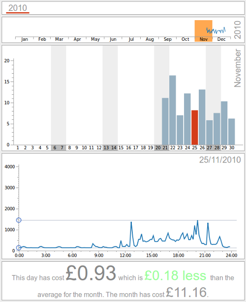
Here’s a screenshot of the site I’ve produced:

The site allows you to browse by year, month and day and also provides an indication of the actual cost of the energy usage. The data is served from a set of static files for each day, rather than driving it straight off the sqlite database. This makes it quite scalable - particularly as only the current day’s data will ever change.
I have made a copy of the site available to play with here. This isn’t being updated with any new data, for privacy reasons, but does demonstrate the interactivity of the graphs very nicely.
There are a few features I’m still thinking about adding, such as being able to compare two days usage and making it easier to identify patterns. I’ll also probably have a couple bugs to fix in 6 days time when I’ll have data spanning two years.